IRTG Course
Introduction to R for genomics
Carl Herrmann & Carlos Ramirez
8-9 December 2021Markers visualization
First, we will take top 10 ranked genes based in Log FC and visualize their expression in clusters using a heatmap representation.
top10 <- pbmc.degs %>%
             group_by(cluster) %>%
             top_n(n = 10, wt = avg_log2FC)
DoHeatmap(pbmc.filtered,
          features = top10$gene) + NoLegend()
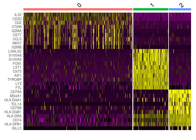
IL-7 is a marker for naive CD4+ T cells, while GZMB is a marker for CD8 T cells. Then, we can tentatively consider cluster 0 and 2 as CD4 and CD8 T cells, respectively.
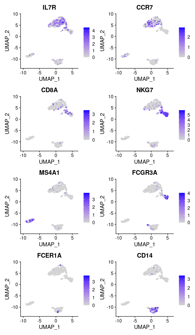
We can visualize additional known canonical markers in order to assign cell categories.
canonical_markers <- c('IL7R',     ## CD4+ cell
                       'CCR7',     ## Naive CD4+ T cell
                       'CD8A',     ## CD8+
                       'NKG7',     ## NK
                       'MS4A1',    ## B cell marker
                       'FCGR3A',   ## Mono
                       'FCER1A',   ## DC
                       'CD14'     ## Mono
                       )

FeaturePlot(pbmc.filtered,
            features = canonical_markers,
            ncol = 2)
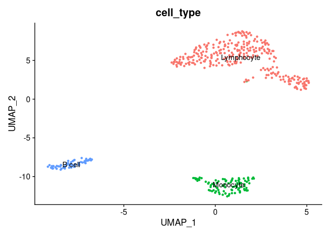
Now, we will annotate the cells with their identified identities in the seurat object. We will map the cluster names as follows:
mapping <- data.frame(seurat_cluster=c('0', '1', '2'),
                      cell_type=c('Lymphocyte',
                                  'Monocyte',
                                  'B cell'))
mapping
##   seurat_cluster  cell_type
## 1              0 Lymphocyte
## 2              1   Monocyte
## 3              2     B cell
To assign the new labels we can use the map function from the plyr R package as follows:
pbmc.filtered$'cell_type' <- plyr::mapvalues(
  x = pbmc.filtered$seurat_clusters,
  from = mapping$seurat_cluster,
  to = mapping$cell_type
)
Now, we can plot the clusters with the assigned cell types.
DimPlot(pbmc.filtered,
        group.by = 'cell_type',   ## set the column to use as category
        label = TRUE)  +          ## label clusters
        NoLegend()                ## remove legends
Visualization of gene expression levels of markers in clusters
We can visualize the expression of the different markers across identified clusters
using violin plots using the VlnPlot() function as follows:
VlnPlot(pbmc.filtered,
        features = canonical_markers,
        group.by = 'cell_type')
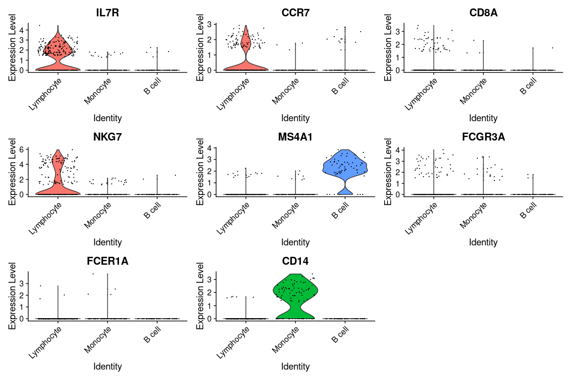
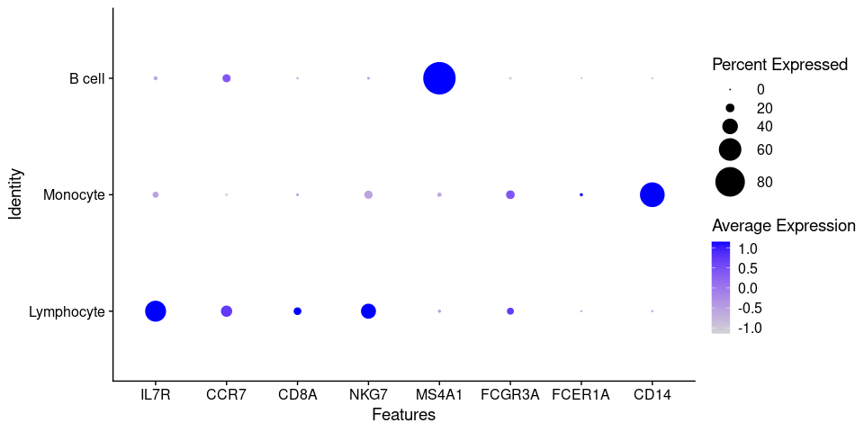
Because of the signal dropout it's hard to say what is the proportion of cells that are actually
expressing a marker. Dotplots are commonly used to visualize both gene expression levels alongside
with the frequency of cells expressing the marker. The DotPlot() function comes at handy.
DotPlot(pbmc.filtered,
        features = canonical_markers,
        group.by = 'cell_type',
        dot.scale = 12)
Final Report
Exercise 1
Provide a report of all your findings (QC, clustering) including plots, parameter selection and conclusions using the 10x PBMC 250 subsampled data
Exercise 2
Using the scRNA-Seq workflow in this pipeline, process the provided dataset of PBMC cells stimulated with IFN beta
Load the seurat object containing the data to a variable named ifnb using the following commands:
url_ifn <- 'https://github.com/caramirezal/caramirezal.github.io/blob/master/bookdown-minimal/data/pbmc_ifnb_stimulated.seu.rds?raw=true'
ifnb <- readRDS(url(url_ifn))
This data is downsampled from the Kang HM et al, 2017 data. Provide a report in a Rmd file.