IRTG Course
Introduction to R for genomics

Carl Herrmann & Carlos Ramirez
8-9 December 20214. Plotting data
To plot data with R, we can use two strategies
- use the built-in functions from the base R: using these functions, we can plot boxplots, heatmaps, scatter plots, etc...
- use the functions from the
ggplot2package.
As part of the tidyverse package and eco-system, ggplot2 has implemented a new way to consider plotting. It is a very powerful way to create beautiful plots. However, the learning curve is somewhat steep... Therefore, we will restrict ourselves to the basic R functions, and refer to numerous tutorials (such as in DataCamp) regarding ggplot.
Let's start by reading in the cleaned data from the last chapter:
dat = read.delim("https://tinyurl.com/87tpvd4c", stringsAsFactors = TRUE)
We load the tidyverse package again
library(tidyverse)
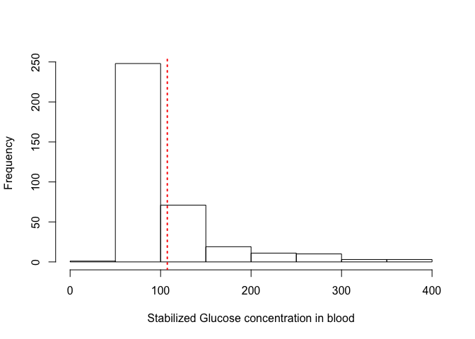
4.1 Histograms
Histograms are used to represent the distribution of continuous values.
hist(dat$stab.glu, xlab = "Stabilized Glucose concentration in blood", main = "")
Change the value of
mainand see how it changes the plot
Add the parameter
breaks = 50in the above lines of code and see what happens. Try different values forbreakslike10, 20, 75, 100and try to interpret the differences.
Type help("hist") to see more details about the histogram function in R. Also try plotting histograms and summaries for other continuous numeric data in our diabetes dataset.
We can also add additional information to the histogram, for example the value of the mean or median:
hist(dat$stab.glu, xlab = "Stabilized Glucose concentration in blood", main = "")
abline(v = mean(dat$stab.glu), lty = 3, lwd = 2, col = "red")
Play with the values of the parameters
lty,lwdto see the effect; Check the help pages with ?graphical parameter
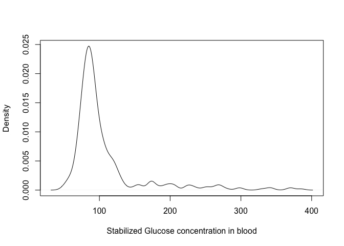
4.2 Density plots
An alternative way to represent distributions is through a density plot; think of it as a smoothing of the histogram!
plot(density(dat$stab.glu), xlab = "Stabilized Glucose concentration in blood", main = "")
You can control the level of smoothing using the parameter bw in the density function; try the following:
plot(density(dat$stab.glu, bw = 1), xlab = "Stabilized Glucose concentration in blood",
    main = "")
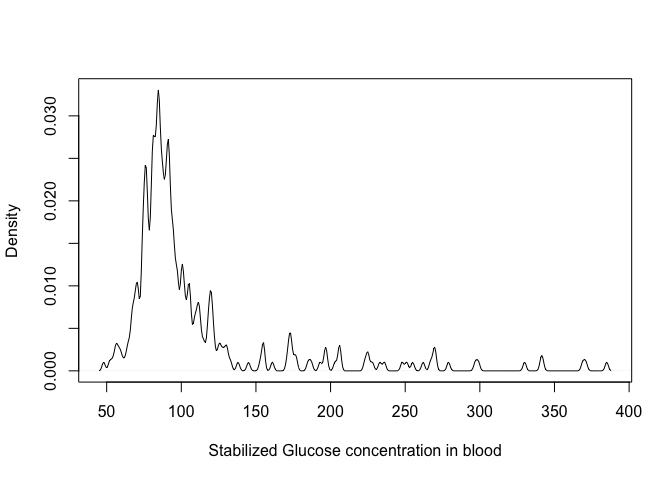
Play with the
bwparameter to see how is changes the density!
Using the function
ablineplot a vertical line highlighting the glucose concentration of300 units.
Click for the solution!
plot(density(dat$stab.glu), xlab = "Stabilized Glucose concentration in blood", main = "")
abline(v = 300, lwd = 2, lty = 3, col = "red")
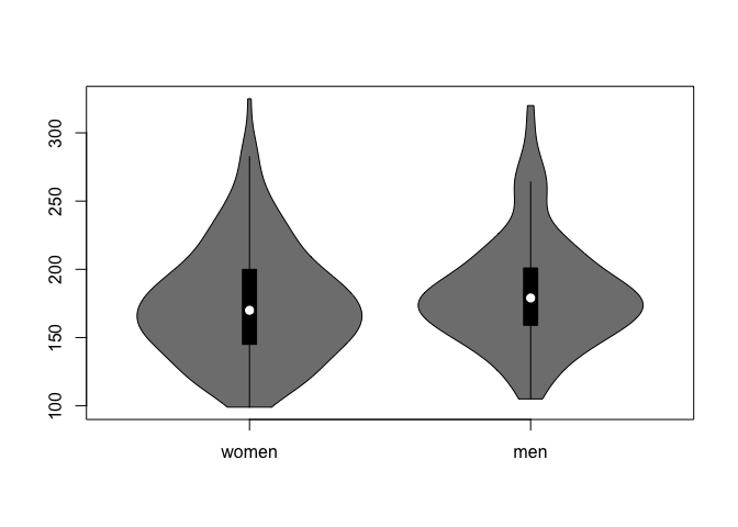
4.3 Boxplots
Boxplots are great to compare distributions between groups; for example, we could compare the weights of men vs. women:
- first, we need to filter men and women
## this is the solution using the dplyr functions (we will see another )
weight.w = dat %>% filter(gender == "female") %>% pull(weight)
weight.m = dat %>% filter(gender == "male") %>% pull(weight)
Use the
summaryfunction to check mean/median/quartiles of these 2 vectors!
Click for the solution!
summary(weight.w)
   Min. 1st Qu.  Median    Mean 3rd Qu.    Max.
   99.0   145.0   170.0   174.9   200.0   325.0
summary(weight.m)
   Min. 1st Qu.  Median    Mean 3rd Qu.    Max.
  105.0   159.0   179.0   182.6   201.0   320.0
- now we can use the
boxplotfunction; if we want to display several vectors of values side by side, we need to organise then inside a list:
## define a list with name `weights`
weights = list(women = weight.w, men = weight.m)

## now use the boxplot function
boxplot(weights)
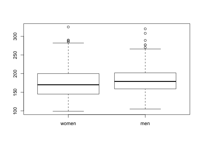
By the way, do you know how to interpret a boxplot?
Click here for an explanation!
The boxplot gives an indication about the most important features of a distribution
- the thick horizontal line in the box represents the median value
- the top of the box represents the 75th percentile; hence, 25% of the values in the dataset have a larger value
- the bottom of the box represents the 25th percentile; hence, 25% of the values in the dataset have a smaller value
- the whiskers which extend above/below the box have a length at most 1.5 times the height of the box; however, they extend at most to the largest value (upper whisker) or smallest value (lower whisker).
- the individual dots are the outliers, which are outside the whisker.
4.4 Violin plots
A similar, but more informative way to display this is using violin plots. In addition to displaying median/quartiles, the violing plot gives an idea about the shape of the distribution (like in the density plots).
If we want to display violin plots, we need to load the package vioplot
library(vioplot)
vioplot(weights)
Make a violin plot showing the distribution of weights of the patients coming from Buckingham vs. Louisa
Click here for the solution!
## we can use the `split` function here
weights = split(dat$weight, dat$location)

## violin plot
vioplot(weights)
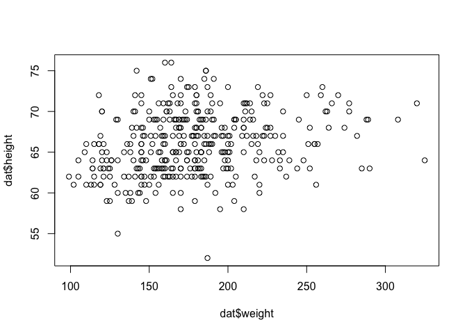
4.5 Scatter plots
So far, we have looked at one variable at a time. But sometimes, it is interesting to check the dependency between variables. This can be done using a scatter plot. For example, we could look at the dependency between weight and height, or weight and cholesterol!
plot(dat$weight, dat$height)
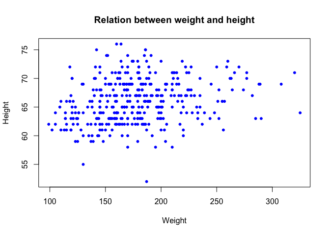
We can make this plot nicer, by adding some parameters to the plot function:
plot(dat$weight, dat$height, xlab = "Weight", ylab = "Height", pch = 20, col = "blue",
    main = "Relation between weight and height")
We can add a regression line in this scatter plot, using the lm function (lm stands for linear model)
## we perform the linear regresion, and store the object in the variable `l`
l = lm(height ~ weight, data = dat)

## we can add the regression line using the `abline` line function
plot(dat$weight, dat$height, xlab = "Weight", ylab = "Height", pch = 20, col = "blue",
    main = "Relation between weight and height")
abline(l, col = "red", lwd = 3)
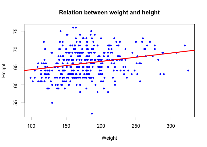
By the way, what is the correlation between the 2 variables? Use the function
corto compute the correlation between the vectorsdat$heightanddat$weightCheck the help page of thecorfunction to compute the spearman correlation
Click here for the solution!
## Pearson correlation
cor(dat$height, dat$weight)
[1] 0.2432956
## Spearman correlation
cor(dat$height, dat$weight, method = "spearman")
[1] 0.2706411
Let's make the plot more fancy, and color the dots corresponding to female patients in red, and male in blue:
We create a vector containing the colors
col.vec = c("red", "blue")
Remember that we converted the gender column into a factor? This will be usefull now!
plot(dat$weight,dat$height,
     xlab='Weight',ylab='Height',
     pch=20,
     col=col.vec[dat$gender],  ## this is the important line here...
     main='Relation between weight and height')
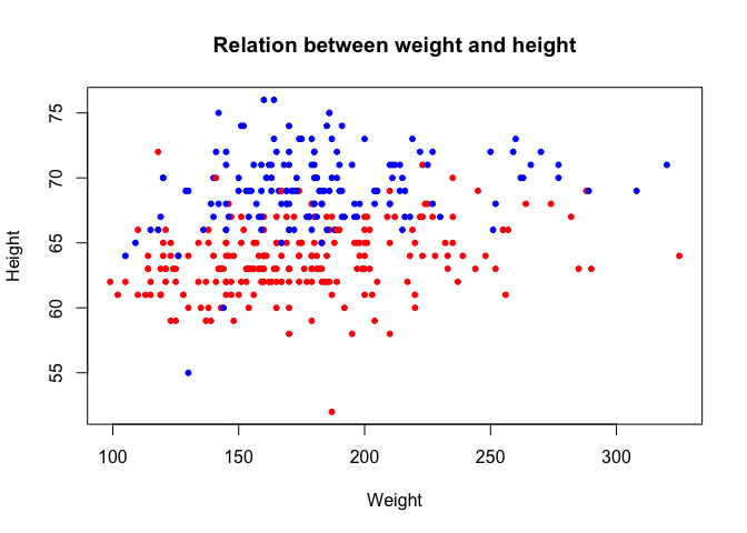
How did this happen? Despite the factor that the column gender looks like character strings, internally, R considers the values as integers: the first level (female) corresponds to 1, the second level (male) corresponds to 2.
Check what happens here:
col.vec[c(1, 2, 2, 1, 2, 1, 1)]
[1] "red" "blue" "blue" "red" "blue" "red" "red"
Passing a vector of 1 and 2 to the color vector selects the corresponding element; hence, since dat$gender is internally considered a vector of 1's and 2's, the same happens: for female patients, the first element is selected (red), for males the second (blue):
col.vec[dat$gender]
  [1] "red"  "red"  "red"  "red"  "red"  "red"  "red"  "red"  "red"  "red"
 [11] "red"  "red"  "red"  "red"  "red"  "red"  "red"  "red"  "red"  "red"
 [21] "red"  "red"  "red"  "red"  "red"  "red"  "red"  "red"  "red"  "red"
 [31] "red"  "red"  "red"  "red"  "red"  "red"  "red"  "red"  "red"  "red"
 [41] "red"  "red"  "red"  "red"  "red"  "red"  "red"  "red"  "red"  "red"
 [51] "red"  "red"  "red"  "red"  "red"  "red"  "red"  "red"  "red"  "red"
 [61] "red"  "red"  "red"  "red"  "red"  "red"  "red"  "red"  "red"  "red"
 [71] "red"  "red"  "red"  "red"  "red"  "red"  "red"  "red"  "red"  "red"
 [81] "red"  "red"  "red"  "red"  "red"  "red"  "red"  "red"  "red"  "red"
 [91] "red"  "red"  "red"  "red"  "red"  "red"  "red"  "red"  "red"  "red"
[101] "red"  "red"  "blue" "blue" "blue" "blue" "blue" "blue" "blue" "blue"
[111] "blue" "blue" "blue" "blue" "blue" "blue" "blue" "blue" "blue" "blue"
[121] "blue" "blue" "blue" "blue" "blue" "blue" "blue" "blue" "blue" "blue"
[131] "blue" "blue" "blue" "blue" "blue" "blue" "blue" "blue" "blue" "blue"
[141] "blue" "blue" "blue" "blue" "blue" "blue" "blue" "blue" "blue" "blue"
[151] "blue" "blue" "blue" "blue" "blue" "blue" "blue" "blue" "blue" "blue"
[161] "blue" "blue" "blue" "blue" "blue" "blue" "blue" "blue" "blue" "blue"
[171] "blue" "blue" "blue" "blue" "blue" "red"  "red"  "red"  "red"  "red"
[181] "red"  "red"  "red"  "red"  "red"  "red"  "red"  "red"  "red"  "red"
[191] "red"  "red"  "red"  "red"  "red"  "red"  "red"  "red"  "red"  "red"
 [ reached getOption("max.print") -- omitted 166 entries ]
Plot the patients from Buckingham as green dots, and the ones from Louisa in orange!
Click here for the solution!
## first build a vector with the colors needed
col.vec = c('green','orange')

## now make the scatter plot
plot(dat$weight,dat$height,
     xlab='Weight',ylab='Height',
     pch=20,
     col=col.vec[dat$location],  ## this is the important line here...
     main='Relation between weight and height')
4.6 Heatmaps
Matrices containing numerical values are usually displayed as heatmaps; each numerical entry in the matrix is displayed using a color, which makes the interpretation very easy!
This makes sense if the columns of the numerical matrix have comparable ranges. For example, the age and weight variables here have very different ranges, so it might be difficult to represent this by the same color scale. However, if we would have gene expression data, then we could use a heatmap.
Here, we will compute the correlations between all numerical values in the matrix, and then display the correlation matrix using a heatmap.
We first extract the numerical variables
dat.num = dat %>% select(where(is.numeric))
We now compute the pairwise correlation between the columns. We have previously used the cor function to compute the correlation between 2 vectors. However, this is an 'intelligent' function. If instead of giving 2 vectors as entries, we give a numerical matrix, the function will understand that we want to compute all pairiwise correlation values!
all.cor = cor(dat.num)
all.cor
                 chol    stab.glu           hdl       ratio       glyhb
chol      1.000000000  0.16544754  0.1709732770  0.48403807  0.27165218
stab.glu  0.165447544  1.00000000 -0.1801048833  0.29889570  0.74090490
hdl       0.170973277 -0.18010488  1.0000000000 -0.69023141 -0.16949641
ratio     0.484038069  0.29889570 -0.6902314087  1.00000000  0.35465342
glyhb     0.271652180  0.74090490 -0.1694964128  0.35465342  1.00000000
age       0.241604908  0.27855141  0.0002152264  0.17156914  0.33222989
height   -0.063230009  0.08247570 -0.0685918173  0.07089817  0.05225072
weight    0.079789987  0.18880052 -0.2829826752  0.27889889  0.16776851
bp.1s     0.201948705  0.15142542  0.0295089053  0.10534657  0.19442279
bp.1d     0.159042299  0.02569721  0.0722451474  0.03484142  0.04786459
waist     0.144089547  0.23369209 -0.2783001009  0.31549761  0.24768684
hip       0.098597154  0.14483314 -0.2222166064  0.20789160  0.15167273
time.ppn  0.006238501 -0.04845774  0.0799388429 -0.05382831  0.03704938
                   age       height      weight       bp.1s       bp.1d
chol      0.2416049084 -0.063230009  0.07978999  0.20194870  0.15904230
stab.glu  0.2785514141  0.082475702  0.18880052  0.15142542  0.02569721
hdl       0.0002152264 -0.068591817 -0.28298268  0.02950891  0.07224515
ratio     0.1715691447  0.070898165  0.27889889  0.10534657  0.03484142
glyhb     0.3322298936  0.052250721  0.16776851  0.19442279  0.04786459
age       1.0000000000 -0.097136587 -0.04621299  0.43303227  0.05891477
height   -0.0971365873  1.000000000  0.24329556 -0.04441181  0.04345208
weight   -0.0462129859  0.243295558  1.00000000  0.09624288  0.18050511
bp.1s     0.4330322675 -0.044411815  0.09624288  1.00000000  0.61984558
bp.1d     0.0589147673  0.043452076  0.18050511  0.61984558  1.00000000
waist     0.1702608196  0.041807866  0.85192261  0.20976399  0.17899079
hip       0.0182966937 -0.117181984  0.82984527  0.15142640  0.16282460
time.ppn -0.0269049474 -0.006180895 -0.06221671 -0.07490369 -0.06376264
               waist         hip     time.ppn
chol      0.14408955  0.09859715  0.006238501
stab.glu  0.23369209  0.14483314 -0.048457737
hdl      -0.27830010 -0.22221661  0.079938843
ratio     0.31549761  0.20789160 -0.053828314
glyhb     0.24768684  0.15167273  0.037049379
age       0.17026082  0.01829669 -0.026904947
height    0.04180787 -0.11718198 -0.006180895
weight    0.85192261  0.82984527 -0.062216714
bp.1s     0.20976399  0.15142640 -0.074903689
bp.1d     0.17899079  0.16282460 -0.063762636
waist     1.00000000  0.83233707 -0.065861241
hip       0.83233707  1.00000000 -0.092519540
time.ppn -0.06586124 -0.09251954  1.000000000
Since all correlation values are between -1 and 1, a heatmap is perfectly adapted here! We can use the built-
heatmap(all.cor)
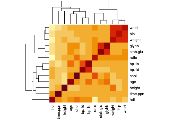
See how the columns and rows have been clustered automatically.
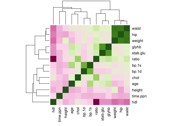
The default colors are ugly... especially, we would like to use a symmetrical color palette, with a different color for the positive and negative values!
We introduce now a wonderful package, RColorBrewer, which offers a plethora of beautiful colo palettes
library(RColorBrewer)
## 10 colors from the PiYG palette
col.cor = brewer.pal(10, "PiYG")

## we can extrapolate to more colors shades
col.cor = colorRampPalette(col.cor)(100)
heatmap(all.cor, col = col.cor, scale = "none")
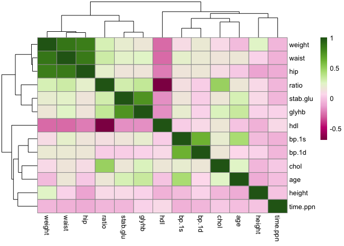
We can use another package, which has a lot of additional functions
library(pheatmap)
pheatmap(all.cor, col = col.cor)
Exercise: plotting expression values
- Load the matrix of expression values from an ALL/AML patients
## read the expression values
all.aml = read.delim("https://tinyurl.com/4w6n3x9k", header = TRUE)
## read the annotation table
all.aml.anno = read.delim("https://www.dropbox.com/s/rxw02jry9y6wgwk/all.aml.anno.csv?dl=1",
    header = TRUE)
Check the type of the
all.amlobject usingtype; as the heatmap function only accepts the typematrix, you need to convert the object using the functiondata.matrix()!Use the
pheatmapfunction to plot the expresion matrix as a heatmap; check the meaning of thescale=...argumentuse the
annotation_col=...argument, and pass the annotation data frame, to add some additional information about the patients!
Click for solution!
## plotting the expression values

library(pheatmap)

pheatmap(all.aml,show_rownames=FALSE)
Well, this is not really nice, because all the expression values (almost) are blue. This is due to the distribution of the values, which is very skewed!
## exemplarily for patient 10
plot(density(all.aml[,10]))
The solution would be to log transform the data:
pheatmap(log(all.aml+1),show_rownames=FALSE) # the +1 is to avoid error if one entry is 0!
We can add annotations for the patients
pheatmap(log(all.aml+1),show_rownames=FALSE,annotation_col=all.aml.anno)
Previous Chapter (Cleaning the dataset)| Next Chapter (Hypothesis testing)